Some companies are blessed by having the right mix of letters in their actual name. Of the 26 letters in the English alphabet, some letters are blessed with good genes that make them balanced and interesting. Other letters are awkward and less fortunate. Let’s take a look.
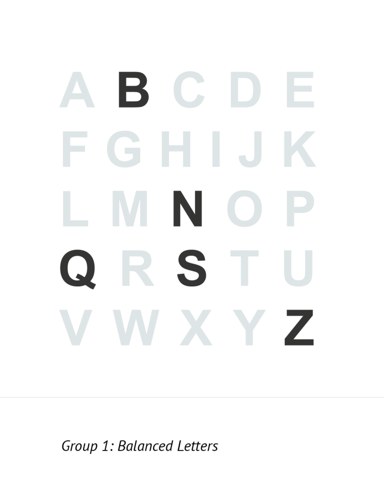
These letterforms balanced. They are likable and interesting. They are confident enough to stand on their own.
I was thrilled to have “S” as the leading character in “Smith House” because I knew that my logomark would be easier to design.
(Honorable mentions in this group are the “K” and “R”.)
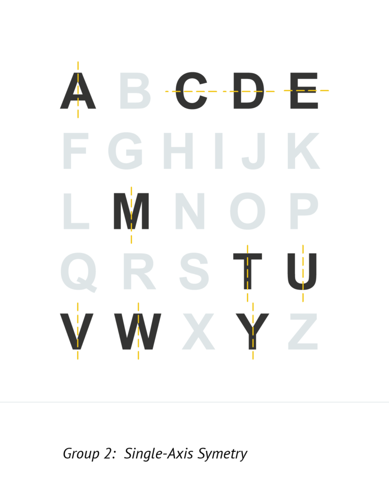
These letter forms are blessed with a single-axis of symmetry. If you have a sequence of letters with horizontal axis, things look good: EDGE. Letters with a vertical axis make the perfect “middle letter” in a 3- and 5- letter name. (e.g. OBAMA and TRUMP.)
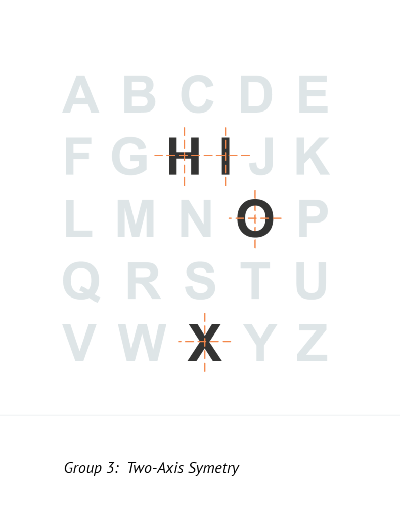
These four letterforms have symmetry across both the vertical and horizontal axes. Wonderful!
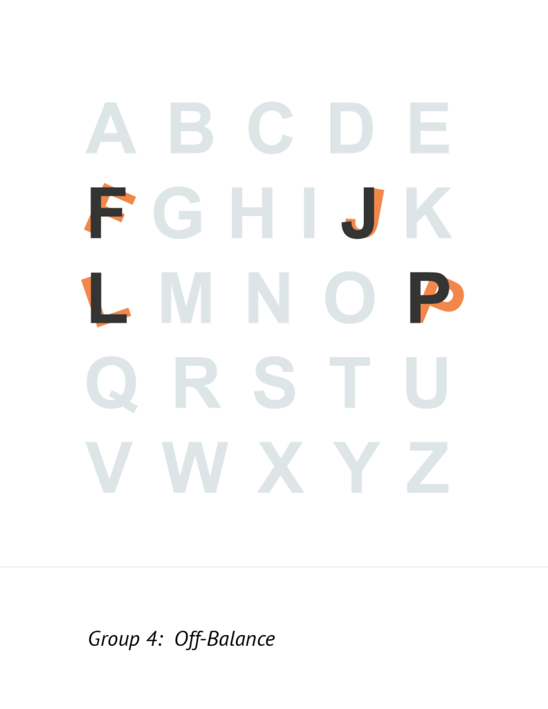
These four letters are off-balance, which often means they don’t look confident by themselves. Also, don’t look good next to other letters.
What about lowercase?
Lower case letters are often more friendly and playful. Think of them as cheerful little fellas with big smiles. Seriously, how adorable are these two vowels: a – e
So if you ever have a company that needs a friendlier vibe, a designer should choose a typeface that has lovable lowers.
Perhaps this is why the designers at Cuban Council opted for modified version of all-lower when a company with a weird / creepy name hired them to make a logo. It’s a random story, but a baby Mark Zuckerberg just walked in their San Francisco office way back before anyone was a billionaire. Read More
Summary
It’s possible to have a cool company with a weird name, and it’s also possible to have a cool company logo built on a sequence of weird letters. Hire the right designer and you’ll be able to navigate those challenges. Just be careful when you get jealous of some other company’s logo. They may look cool just without having to nearly as much work.
The post Secret: Some Logos are Easier to Design than Others appeared first on Smith House Design.